TL;DR
- Android 17 is said to be shifting away from flat design toward translucent, blur-heavy visuals.
- Google could roll out a frosted-glass look across core UI elements, including the volume slider and power menu.
- Dynamic Color will reportedly tint blurred panels, helping the new transparency effects blend with your wallpaper and theme.
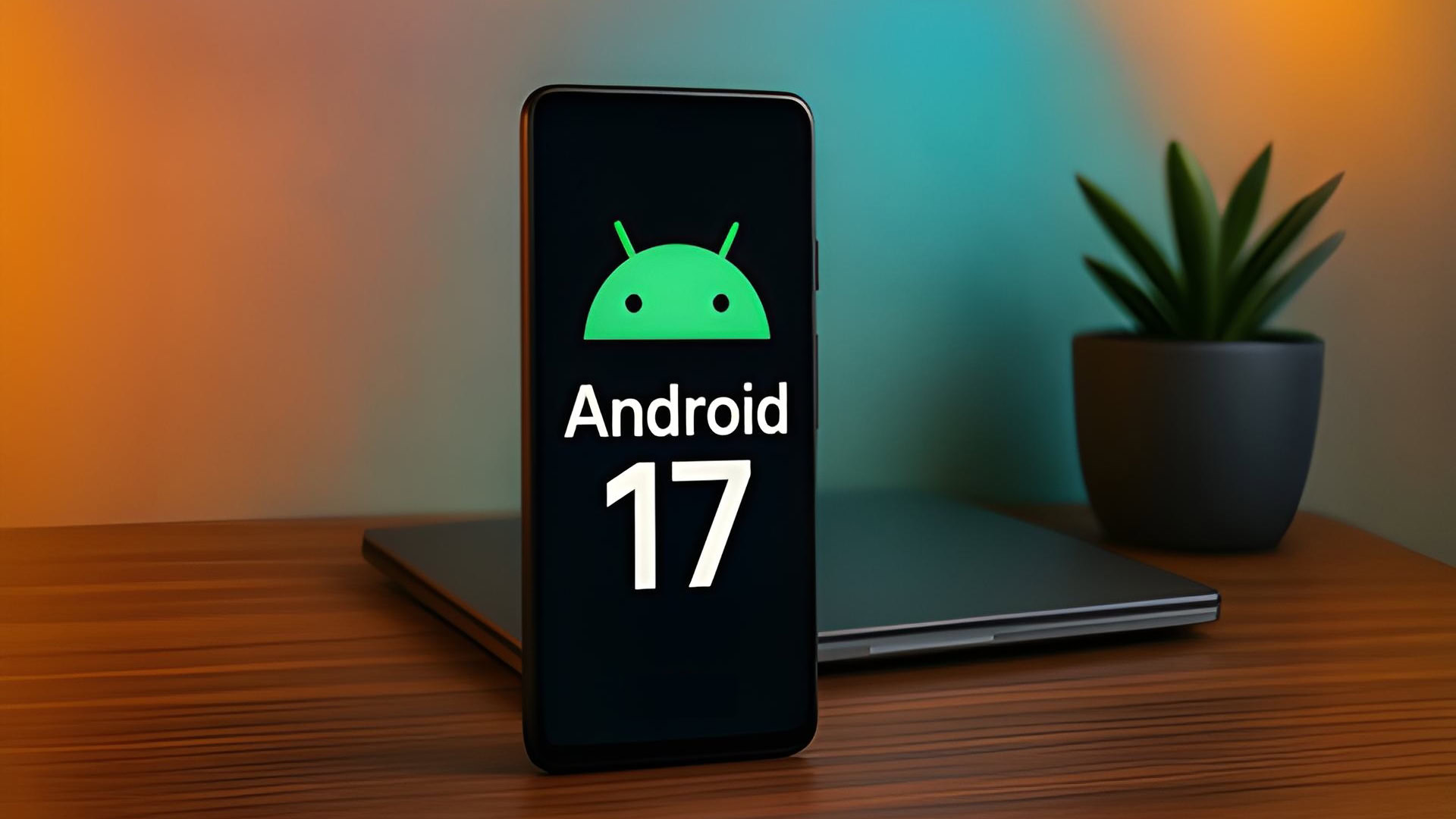
Android 17 is still months from its official launch, but it’s clear that Google plans to change how you use your phone. After years of flat, solid colors, the next version — codenamed “Cinnamon Bun” — is said to focus on translucent, blurry backgrounds.
We saw the seeds of this change planted last year with the introduction of Material 3 Expressive, which brought subtle blurs to the notification shade and the Quick Settings panel. Google wanted to create a sense of depth so that the user interface felt lightweight rather than like a heavy, opaque wall of color blocking your view.
By blurring the background instead of hiding it entirely, you stay aware of the app you were just using while focusing on the task at hand. It creates a hierarchy that feels more natural to the human eye, and Android 17 is set to take that concept to the next level.
Don’t want to miss the best from Android Authority?
In the next version, Google is going all-in on the frosted-glass look across the system. Internal builds seen by 9to5Google show this translucent effect appearing in nearly every part of the UI. One big change is the volume bar, which now uses a translucent slider so your wallpaper or app icons show through.
This approach also applies to the power menu and other system overlays. The blurs are reportedly tinted by your Dynamic Color theme, helping the whole OS feel unified.
While some might point out that this look follows Apple’s Liquid Glass design on iOS or Samsung’s recent UI tweaks, Google’s implementation is reportedly more subtle and refined.
We’ll likely notice these changes most when the first Android 17 Developer Preview arrives, expected in early 2026. The blur effect is expected to appear mostly in system menus, but it’s unclear if Google will bring this look to third-party apps with new Material Design guidelines.
Thank you for being part of our community. Read our Comment Policy before posting.
